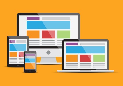
The Importance of Responsive Web Design

Have you ever accessed a website on your phone, only to find that it’s difficult to navigate or the layout is completely off?
As more and more people use their mobiles for browsing, having a website that looks great on every device is very important.
And this is where responsive web design comes in.
It’s the practice of creating websites that can adapt to different screen sizes and resolutions ensuring a seamless experience regardless of the device.
Infact, 94 percent people normally judge a site, based on how responsive the web design is.
This means ignoring it can be a huge mistake.
If you are wondering how, you can make your website more responsive; we have got you covered.
Below, we will be covering everything you need to know about responsive website development, so let’s dive right in!
What is a Responsive Web Design?
Before we dive into the importance of a responsive design and how to achieve one, let’s first understand what it exactly is.
In theory it’s an approach to make your website look same on every device. But what does it mean in real life?
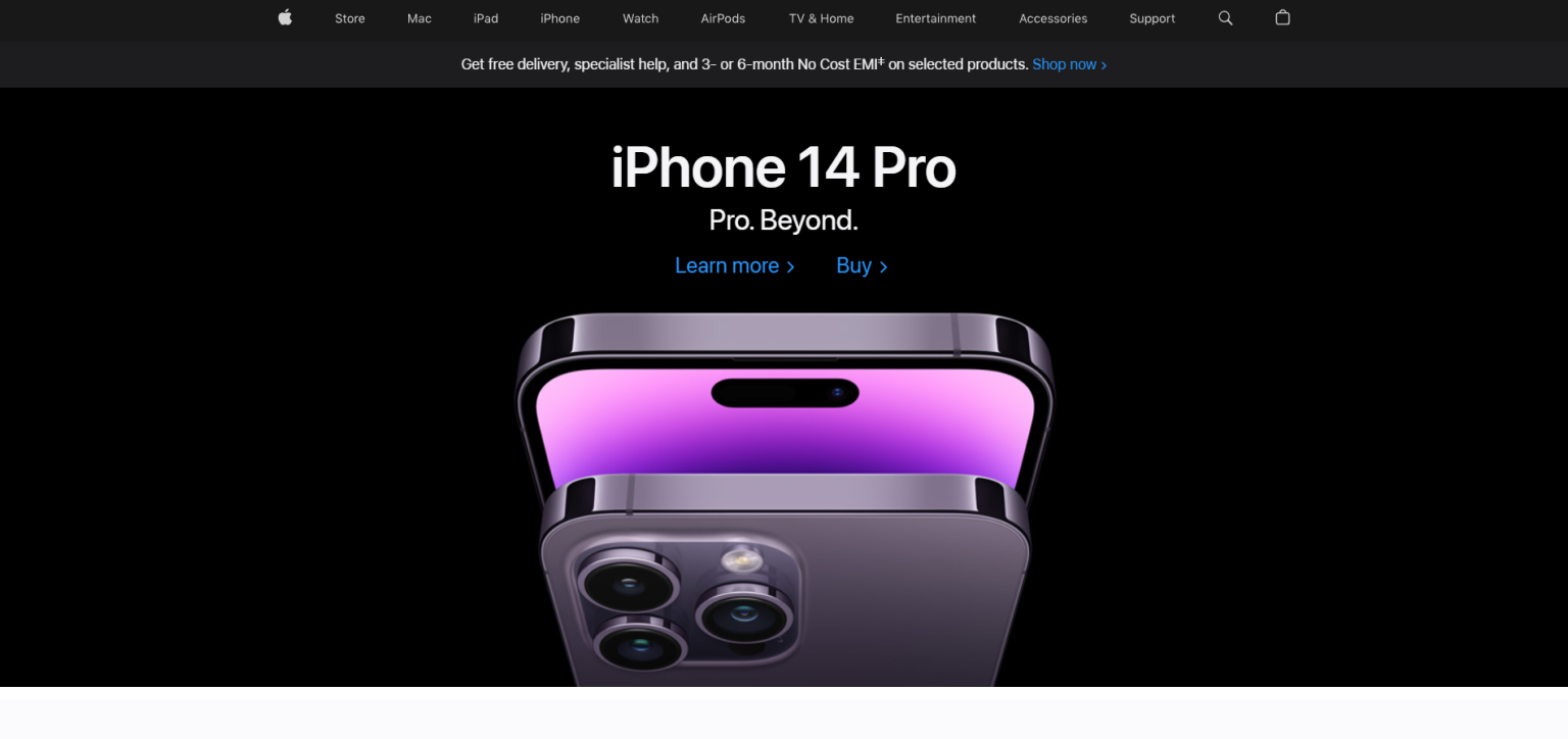
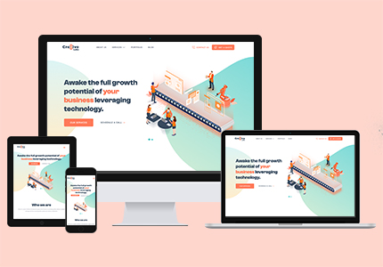
Let’s look at example. Here’s a website that we all might have seen multiple times – Apple. This is how the website appears on desktop.
Now, let’s take a look at how the website will look if we access it from a mobile phone:
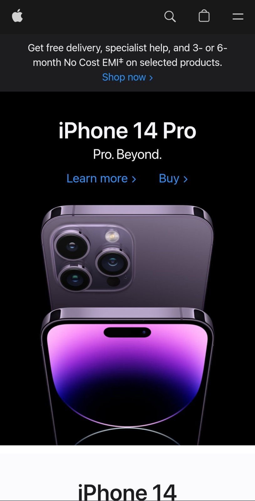
Can you see it? Everything from buttons, fonts and images to color is kept consistent. The elements are designed to fit small screen. A responsive design lets you maintain consistency across different devices, as we have shown above.
What are the different types of responsive web design?
Now that we understand what responsive design is, let’s break it down. In general, there are two main types of responsive design: Adaptive and Fluid.
- Adaptive design involves creating different versions of a website for different devices, with each version optimized for the specific device it’s designed for.
- However, Fluid design involves creating a single website that adapts to the screen size of the device it’s being viewed on. This approach uses flexible grids and media to ensure that the website looks good on any device.
Choosing one option would mean disregarding the other, this is why many designers choose the Hybrid approach.
This means they use elements of both Adaptative and Fluid designs when building the website.
For example, designers may use a flexible layout for the main content area of the website, but use adaptive layouts for sidebars, and navigation menus.
As this will result in a highly customized and tailored responsive design.
Key Benefits of Responsive Website Design
One of the biggest advantages of responsive website development is an optimal viewing experience across all devices.
But what this means exactly?
This means the users will be able to browse the website seamlessly on desktops, laptops, tablets, and mobile devices.
But that’s not all there are several other benefits discussed below.
Improved User Experience
According to a study, 94% of users cited poor design as the reason they mistrusted a website.
So, if you want to build trust with your users, creating a better experience is the way to go.
Mobile responsive website design ensures that your website is easy to use and navigate.
Users don’t have to zoom in or out or scroll left and right to view the website’s content. This automatically translates to a better user experience and increases their chances of staying on your site for a long time.
Better SEO
It’s no surprise that in addition to users, Google and other search engines prioritize websites that are responsive.
A responsive website leads to higher engagement rates, and leads to more conversions.
So, a responsive website design will automatically improve your search engine rankings.
A responsive web design means:
- Faster page load times
- Fresh and useful content
- Social sharing options
- Appealing and easy design
All of these are elements that makes a user wants to stay. It reduces the bounce rate of a website and plays a major role in SEO as well.
Increased Mobile Traffic
As the global mobile users increase, responsive design has become essential to reach a wider audience.
Mobile devices account for over half of all internet traffic, and that number is only increasing.
Catering to the needs of mobile users has become one way to stay ahead in the game. And responsive web design allows you to do just that. It helps you reach more people using the same website.
So, if you don’t want to miss out 50% of all users, mobile-friendly website design is the way to go.
Increased Consistency Across Devices
Consistency is one of the most important factors, why? Because it stops the user from thinking.
Imagine if you are preparing to have dinner and went in the kitchen to collect cutlery. But it’s not in the same drawer. So, you had to open every drawer in the kitchen until you finally found what you were looking for.
Isn’t it frustrating?
However, a responsive web design ensures that doesn’t happen to your website.
This means your website will look and functions the same on any device. The same menus, buttons, and layouts will be followed for both desktops and mobile.
So, Users can access the same content and features on any device, which provides a consistent user experience.
A consistent user experience will increase engagement, reduce confusion, and improve brand perception.
Key Features for Designing Responsive Website
Now that we have talked about the benefits of a responsive design, let’s look at some of its key features. These features will actually help you get your plan into action. Let’s take a closer look at some of them:
Flexible Grids
Flexible grids are the backbone of responsive design.
They create a layout to adjusts the size of the screen, whether it is a desktop, tablet or mobile device.
But why are they important? Because they help in maintaining consistency.
They allow designers to maintain the overall structure of a website while making adjustments to the size and position of elements.
So, when the designers adjust the website for a smaller screen, the website will still look and function the same.
Flexible Images
Flexible images adjust to the size of the screen. This means, these images will adjust according to your desktop, iPad or phone.
The main purpose of flexible images is to ensure that no image appear stretched or pixelated on different devices.
But how is it done?
By adjusting the size of the image to fit the screen. Yes, every image is adjusted to fit the screen scree, and thus none of them is too big or small for the screen.
This is how the overall design of the website is maintained.
Media Queries
Media queries are CSS code that is used to apply different styles to a website depending on the size of the screen.
But why?
Because these queries allow designers to apply specific styles to a website depending on the device it is being viewed on.
For example, the designer can apply a specific style to a website if they are building it specifically for mobile phones.
This makes the website look good and easy to navigate on any device.
Responsive Typography
Have you wondered how when browsing website on phone or desktop, we don’t feel any significant shift in fonts or text styles?
It’s because of responsive typography.
Responsive typography is one that adjusts to the size of the screen.
It goes beyond font and style, but the idea is to create something that “self-adjusts” to the device it’s being viewed on.
Since typography makes up to 90% of the content of digital products, Responsive typography is essential to ensure that text is easy to read on any device. Designers can create a scale to adjust the size and style of the text to fit different screens.
Tools for Responsive Website design
The benefits of a responsive design are clear, and fortunately, you can even hire dedicated responsive web developers to help you create a responsive website.
But that’s not all, there are number of tools available to help you design and build a responsive website.
These tools are used by expert designers and are perfect for a responsive website. Some of the most popular ones are:
Bootstrap:
Bootstrap is a popular front-end framework for building responsive websites and web applications.
It includes a set of CSS and JavaScript components making it easy to create responsive layouts, forms, buttons, and navigation menus.
Why is it used?
Because it is easy to customize, and it there is a large community of developers who contribute to its development.
It also offers many pre-built templates and themes, making it a great choice for beginners as well.
Foundation:
Foundation is another popular front-end framework for building responsive websites and web applications.
It includes a set of CSS and JavaScript components that make it easy to create responsive layouts, forms, buttons, and navigation menus.
Foundation is also used because it is highly customizable and includes many pre-built templates and themes.
It also offers advanced features like responsive typography and mobile-first design.
Materialize:
Now, we are coming to tool that are a bit more advanced like Materialize.
It is a front-end framework based on Google’s Material Design guidelines.
Like all the other tools, it includes a set of CSS and JavaScript components making it easy to create responsive layouts, forms, buttons, and even navigation menus.
But why use it over others?
Because it’s a more modern and consistent design language.
It also has reusable UI components that help constructs attractive, consistent and functional web pages.
Flexbox & CSS Grid:
Flexbox & CSS Grid are CSS layout modules that creates flexible and responsive layouts. They offer many features like flexible sizing, alignment, and ordering of elements.
They have become a popular option because of they are easy to use and offers powerful layout features.
But since it is supported by all modern browsers and offers great flexibility in creating responsive layouts, Flexbox and CSS Grid is often preferred by many developers.
Final Words
With the increasing use of different devices, it’s important to prioritize responsive website development to ensure that your website is accessible to all users.
Implementing key features and fundamentals of responsive design will help you create a website that is both visually appealing and functional.
Remember, a responsive website can help improve your user experience, and ultimately lead to business success. So, when are you taking a step to make your website responsive?

Post a Comment