9 Best Web Design Practices to Improve User Experience

When it comes to creating a website, your first goal should always be to create a user-centric website design. So, the visitors have a good experience.
But why?
Imagine going to a grocery store where everything is cluttered.
- Imagine going to a grocery store where everything is cluttered.
- The lighting is too dim
- Even the products are not in the right place.
Would you ever want to go back there?
No, right?
What if I tell you the same thing applies to your website?
Yes, in today’s digital age, first impressions are everything and a poorly optimized website can cost you valuable traffic.
In fact, an NAU article states that “88% of online consumers are less likely to return to a site after a bad experience.”
So, if you want users to stick around or come back, you need an optimized and user-friendly website.
In this article, we will walk you through some of the best website design practice you can start putting in place today to improve the accessibility and user experience of your website.
Make navigation easy
The first step towards achieving user-friendliness is fixing navigation. Think about it — If your website is difficult to navigate, visitors will not be able to find anything. They will quickly become frustrated and leave.
However, there are several simple ways to make navigation easy for them. Like, adding a clear and simple navigation menu.
This might not seem like much, but it will make it easy for visitors to quickly find the information they need & encourage them to stay longer on your site.
Have a look at Howard University’s Navigation menu. It is simple, intuitive, and has all the information a visitor might need.
There are some other ways to improve the navigation of your website like:
- Organizing your content in a logical way
- Using descriptive labels for your menu items
- Providing dropdown menus for items with excess content.
Simple things like this can make a huge difference in the navigation of your website, and are considered best practices in UX design for a website.
Optimize for mobile
“50% of smartphone users are more likely to use a mobile site when browsing or shopping”. – HubSpot
So, unless you want to avoid 50% visitors, you should also focus on Mobile-first UI UX Designing.
When talking about mobile optimization, the first thing you need to consider is the different screen sizes and resolutions your website will be viewed on.
And to optimize for this, you can use responsive design techniques, such as flexible grid layouts and images that scale to fit different mobile screens.
But that’s not all,
Your UX Designers will also need to optimize navigation for a smaller screen.
To do this you can:
- Use larger text and buttons
- Simplify the navigation menu
- Optimize the website for different mobile screens.
Additionally, you will need to ensure the content is easy to read on a mobile device. And how do you do that? By using a larger font size, increasing line spacing, and avoiding small columns of text.
Use high-quality images
High-resolution images can make your website look more professional and engaging.
We have all heard that “A picture is worth a thousand words.”, and adding quality images to a website is a powerful way to capture users’ attention.
Many site owners know this, but they often forget a fundamental part of this equation – “Quality”.
When it comes to images, quality is key.
You can achieve this by using high-resolution images that are well-lit and in focus.
Additionally, you should also make sure that the images are properly optimized for the web and are not too heavy.
Why? Because properly optimized images will keep your website fast, and add to the overall experience. This is why quality images are an important part of Enterprise UX Design.
Two other aspects of image optimization are Relevance and Placement. So, make sure you use images that are relevant to your brand and placed optimally.
Lastly, don’t forget to add alternate text (alt-text) to your images for accessibility.
According to Baymard, 55 percent of websites don’t use alt text. It can be a huge mistake if you want search engines to understand them.
So, make sure you add alt text to your images.
Make sure your site is fast
You may think that speed has nothing to do with design — But how will a user get to the design if they don’t get to the website?
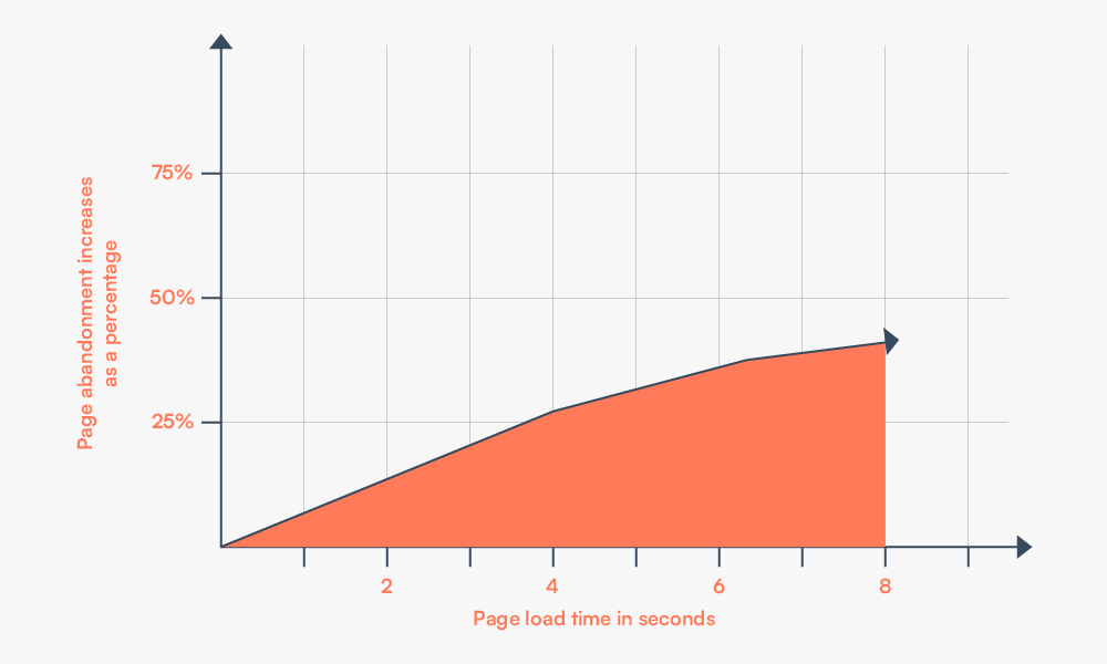
Approximately 25% of people leave websites that take more than Four seconds to load. So, if your website isn’t loading in less than 4 seconds, the visitors will not even get to the website.
This is why, before creating the perfect design, or investing in a UX Strategy, you need to work on your loading speed.
But how to achieve a faster loading website? Here are a few steps:
- Compress your images,
- Minify CSS
- Minify JavaScript,
- Reducing the number of HTTP requests your site makes.
- Use a CDN
These are just a few steps to make your website load faster. You can do a lot more than this to optimize its speed and performance.
There are several tools such as Google’s PageSpeed Insights and GT Metrix to test your website.
You can use them to identify problems on your site and ensure better user experience.
Provide helpful error messages
Error messages are an important component. Why? Because this is the first thing your user will see when something goes wrong!
So, it is crucial that your error messages are sympathetic that encourage users to take the next step.
But that’s not all, in addition to affecting user experience, error messages also affect a site’s rankings too.
This is why you need to provide helpful error messages to guide visitors back to where they need to be, and improve user satisfaction.
You can do that by making sure your error messages are specific and actionable. Share detailed information about what went wrong and what the visitor can do to fix the problem.
- Keep them short and to the point
- Tell them what went wrong and how they can fix it.
- Use simple words and avoid technical jargon
- Offer them solutions and directions
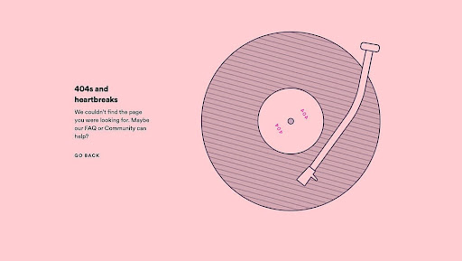
Below is an example of a simple 404 error message from Spotify. Your goal should be to create something like this:
Implement a responsive design
Your website will be accessed on a number of devices, and you should ensure it is responsive on all of them.
Having a responsive web design will ensure that your website looks and functions well on a variety of different screen sizes.
But how do you create a design that looks well on both mobile and desktops?
By using flexible grid layouts and images that scale to fit the screen. CSS media queries let you adjust the layout of your website depending on the screen size and resolution.
It allows you to maintain a consistent design on different screens.
Additionally, you should optimize your website so that it loads efficiently on different connection speeds.
It is important to get professional UX Designers to test your site on different devices, browsers, and screen sizes to see how it adjusts.
Doing this lets you create a fully optimized website for all visitors.
Use clear and simple language
Using clear and simple language doesn’t mean forgetting about grammar or punctuation. It’s about communicating clearly.
Using simple language means writing things in plain words and avoiding technical jargon.
For example, instead of saying “We apologize for the inconvenience caused ‘, you could simply say “we are facing some troubles and we will be back soon!”
A plain and simple language will let you speak to a range of people with different levels of education and knowledge.
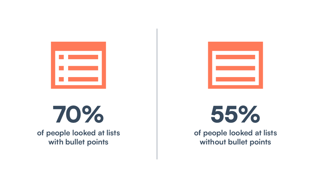
Using bullet points could also help you share things with visitors in a more scannable format. In fact, as per the image below, 70% look at a list if it is divided into small bullet points.
 Here are some more ways you can use simple language to improve user satisfaction on your website:
- Use shorter sentences and paragraphs
- Avoid using complex grammar structures
- Use bullet points to break your text
- Make it scannable
Using simple things like this can bring a lot of difference and make the visitors want to stay longer.
Use a consistent color palette
Consistency in color can help create a sense of cohesiveness and professionalism on your website.
Let’s take Starbucks for example.
When you think about it, what pops into your head? A logo? A coffee cup? A prime location?
And guess what you will find when you visit their website? Yes, green and white!
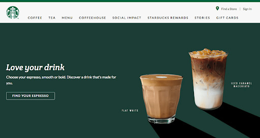
This is the importance of color, and this is why you need consistency in your color palette. Having a consistent palette establishes a brand in our minds — like Starbucks.
But how do you achieve this?
First, you choose your colors. Make sure you select a limited number of colors and use them consistently throughout your site.
This means using the same colors for your text, backgrounds, buttons, and other elements.
But one thing to note is ensuring that the colors you choose work well together. Make sure they complement each other and create a cohesive look.
The next thing is the contrasts. You should create a color contrast on the website that is appropriate and easy on the eyes.
When both of these things are done in harmony, your website will look professional and welcoming!
Make your site SEO-friendly
“75% of people don’t scroll past the first page on a Google search.” So, all your user-centric website design efforts will be irrelevant if you are not on the first page!
This is where SEO comes in.
Optimizing your website for search engines can ensure that your site is easily discoverable by potential visitors.
optimizing for SEO is not the same as design. Here is what you will need to do:
- You will need to create useful and keyword-optimized content
- Internal linking of all your pages
- Make your website crawl friendly by (using headings and subheadings and including a site map)
- Get backlinks from reputable sites
- Use alt text for images
But don’t worry, there are many tools like Google Analytics and Google Search Console to make this process easier for you.
Make sure you keep optimizing your website to rank high consistently.
Conclusion
Since digital mediums are growing every day, you want your website to be accessible to all. Applying these best website design practices will make your visitors feel welcome on the website.
We’ve covered a lot of ground in this article but remember, you don’t have to overdo it! Take it one step at a time and your website will start to improve.
Or you can hire a professional Web Design Agency like Cre8ive Labs to make the whole designing process easier for you!
So, which one of these are you excited to try on first?

Post a Comment